
In the haze following the release of Mapfest we’ve picked up Repcol again to work on for its 10. of October deadline. Repcol aims to pack together the available metadata about the collections of the National Museum into one dynamic illustration.
Before the Mapfest crunch set in we completed the wrangling so it was more or less ready to just start assembling into visuals. We lost almost half of the 60k works due to lack of data coverage. Which is kind of sad, but I think there’s enough still for it to be interesting.
We’ve settled for a simple timeline view, with each artwork being packed upwards on the y-axis. Each artist represented by a tetragonal prism (yes, a box) colored by gender. Each work they produced, a thin line along one face.
And yes, I know – enough with the data sculpture already. I could enumerate the reasons why this is a reprehensible representation in terms of legibility and how aggregation would be so much better suited. Instead I’ll post some pictures here and go back to tweaking my tilt-shift parameteres and revelling in my open brief.
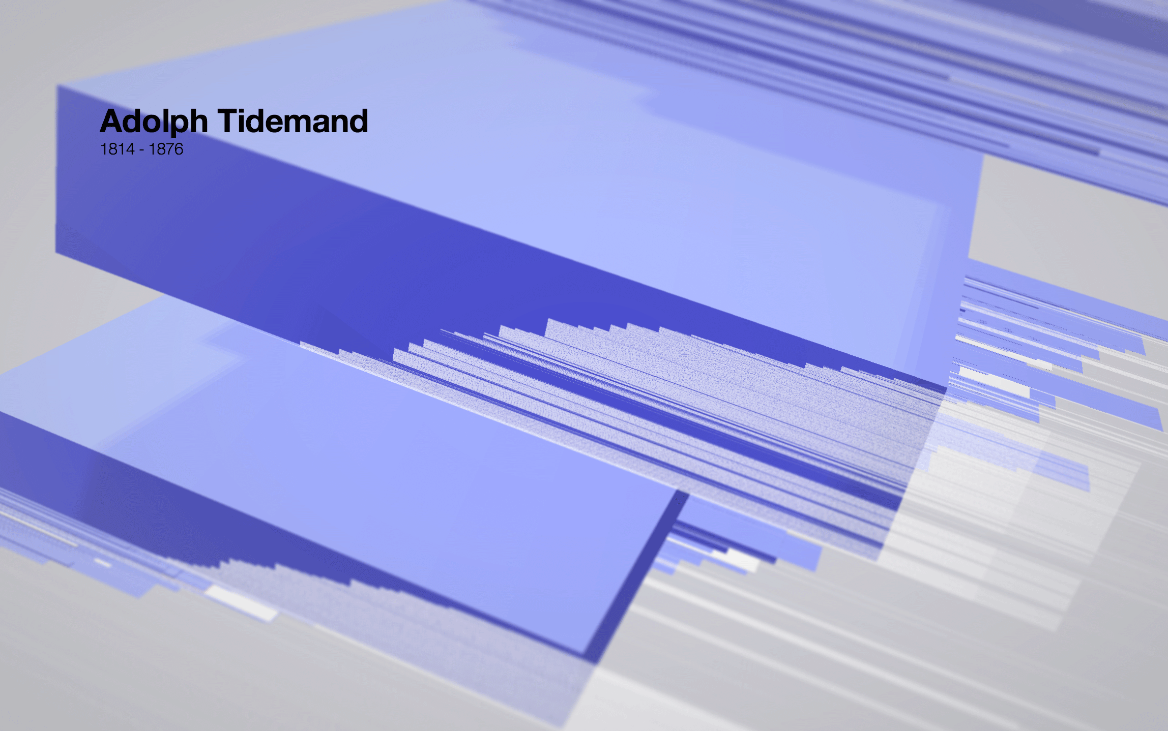
Adolf Tidemand – box shows gender and amount of works collected. Work creation and acquisition shown by white lines. Gaps in lines reveal on y axis show gaps in archive metadata. Works have been acquired in two batches. Perhaps as a gift to the museum
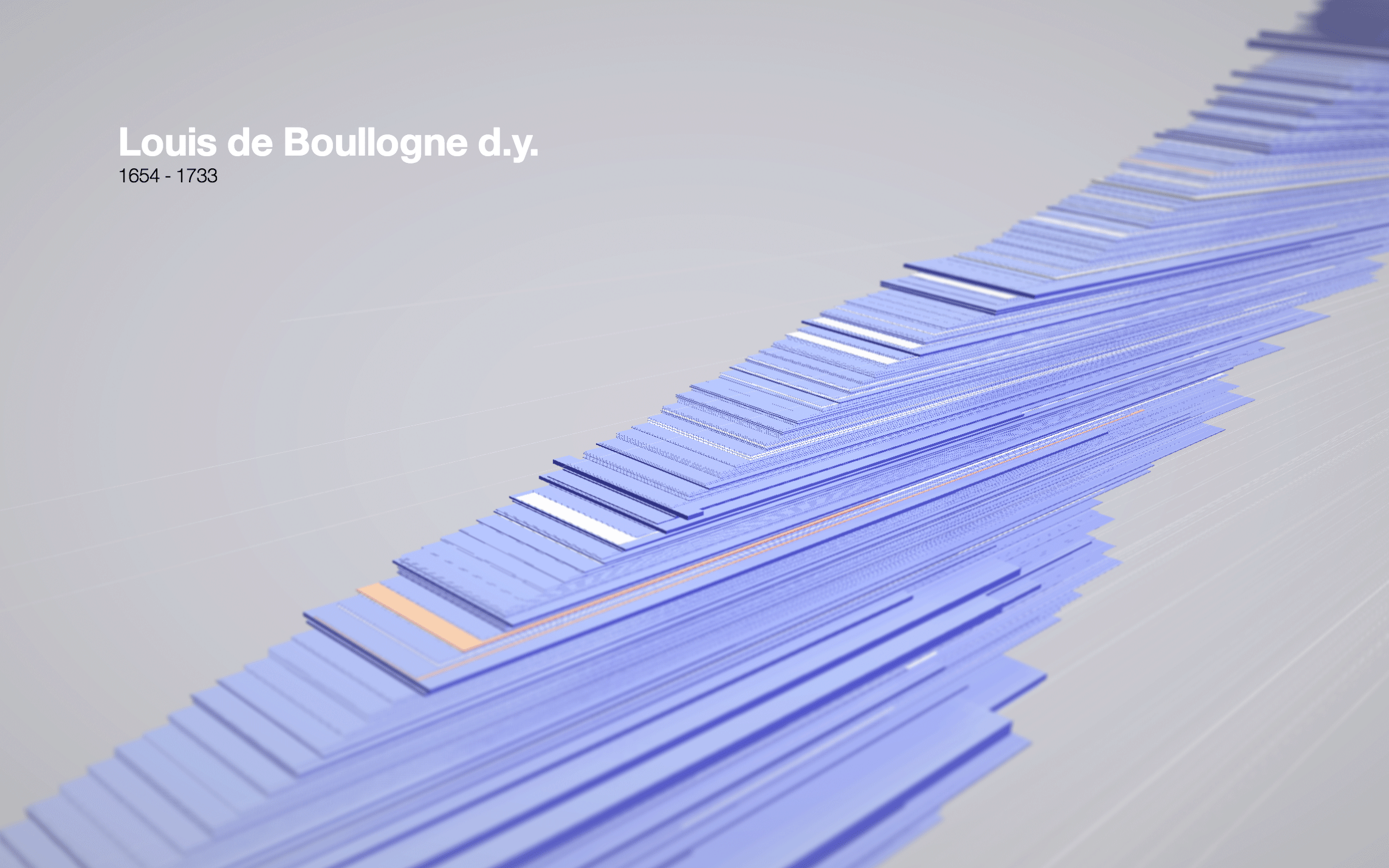
Suprise. Few women figure in the collection strategies that acquired work from the 1600s.
The close-ups of the model are fairly nice to look at. We’re still not completely happy though with the strange wing-like shape the shole thing occupies in space. There is also code to write to make the structure easily navigable and searchable. And not least: actually display the works of the artist chosen.
More from the blog
- Bengler Wins Jacob’s Prize 2016
- Simen made an opera about transhumanism*
- Deep Learning at the Museum
- Status / Arrivals
- Lego vs. Lego
- Spare Time Protein Origami
- GRBL with permissive license (MIT)
- We're building a 3d printer!
- Terrafab, now available in huge and tiny
- Checkpoint: Repcol
- Launch: Mapfest!
- Being in Nothingness
- Planning the brewery