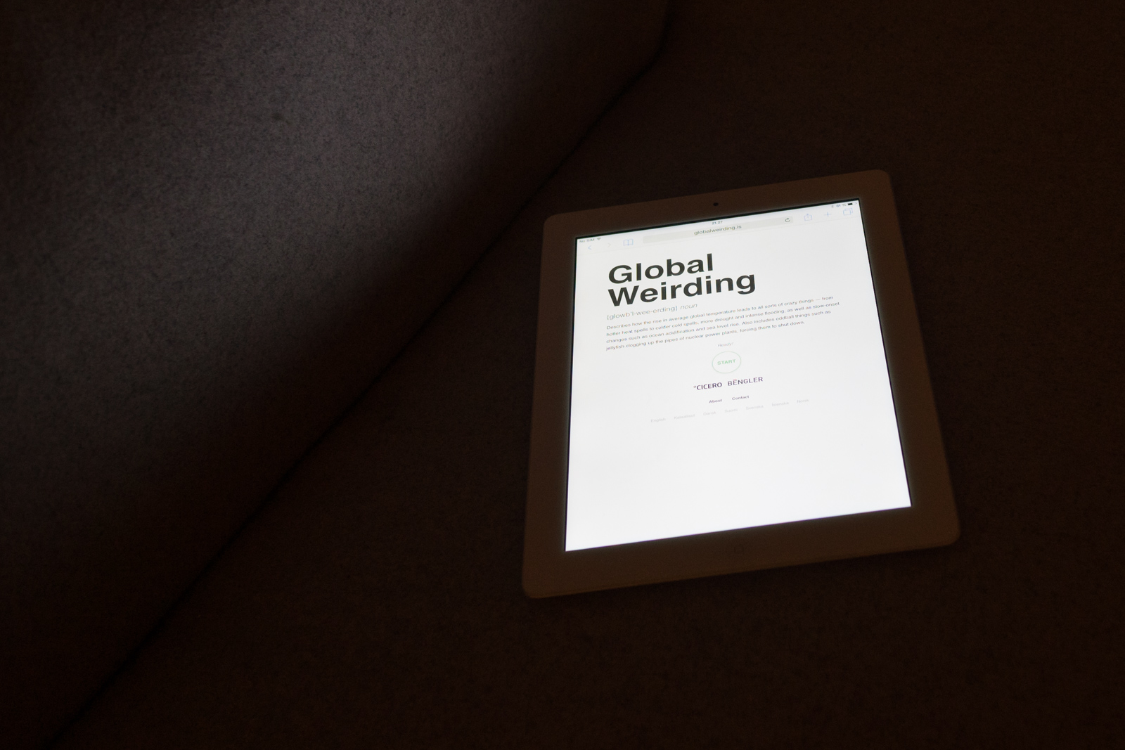
The latest report on climate change from the UN is one hefty document. Still it might be the single most important document in the world at this moment. This is an attempt at creating one interactive visualization letting anyone digest the key findings of the report in a couple of minutes: The weird global impacts of unchecked climate change, and what we should have started doing immediately five years ago in order to stave off the worst consequences.
The international research institute CICERO approached us late spring 2014: Could we digest and communicate the key findings contained in the AR5, the Fifth Assessment Report, from the IPCC, the UN International Panel on Climate Change? In an entertaining yet sombre manner? In three months? In 7 languages? We accepted given that we could use data from the actual experiments to do some of the talking.
There is much to be fascinated about when it comes to discourse on future climates. The scope of the effort to model and understand the future. Peer reviewed crystal balls, constructed to tell us about the future, of the only sentient species we know. The partisan politics. The cognitive dissonance. The shopping and the denial.
This seemed a project to really get right. We ended up working with data from all three working groups.
WG1 – Earth Climate System Simulations
We had so much fun with this: Scientists have been using modelling to gauge the response of the climate to greenhouse gases since the 1980s. In recent years the models have become more granular, and as part of the Fifth Assessment Report an entire posse of models was developed at research institutions around the world.
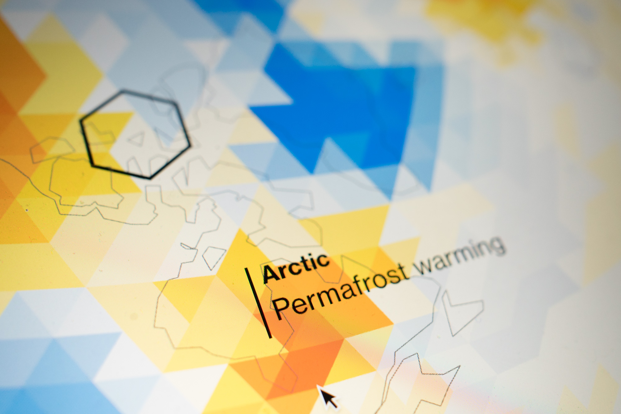
In their report the IPCC use the models to generate a surface temperature in 2080-2100 by averaging all the different model runs over a 20 year period. But the models contain much more data in the temporal dimension – they tick every 8 hours, offering 125560 frames from 2014 to 2100. Of course – the daily data gives an impression that the model knows something about the weather on a random day, like 28 October 2040. Which of course it doesn't. On the other hand, only showing the long term trend gives the impression that the future will just be plain warmer, without all the weird weather. This is the difference between weather and climate.
We ended up visualizing all of this data in our prototype, complete with surface temperature, precipitation, wind-patterns. It looked truly awesome but actually in the noise of all that weather you can't really see the terrifying story with your bare eyes. So we tore away all that detail and worked with the climate scientists at CICERO to build a dataset showing how the surface temperature varies compared to pre-industrial levels. This clearly shows that even though the weather system has plenty local variations complete with cold spells and all, the earth is warming overall. By a lot over the next 90 years if we do nothing.
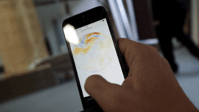
We had lots of fun wrangling those huge datasets (arriving in a (to us) obscure climate-scientist-specific data format NetCDF, wrangled using NumPy/SciPy) and creating browser-ready frame-sheets. In the browser we load these sheets semi-aggressively and map them onto a sphere, applying colors and displaying them along with continent contours using the 3D engine three.js. When moving slowly in time we interpolate between frames.
We render in WebGL on capable devices and fall back to software rendering on platforms like IE10 and Android. As far as we know it runs on all current hardware including low-end smart-phones – though we expect there to be a few exceptions. New hardware gets really decent frame-rates.
WG2 – Impacts
The people at CICERO are heroes. They scoured the technical reports for climate impacts, rewrote them in clear, short fragments and placed them in time. They then wrote future speculative newspapers headlines to go with the impacts. Some of them are really funny. In a twisted, dark kind of way. Every impact is supplied with an in-depth explanation and a reference to the relevant part of the report for the budding climate nerds among us. Then the entire thing was translated into 7 languages (apart from the detailed descriptions – there just wasn't resources for that). We thenbuilt a layout engine that makes an effort to place the impacts in time given the available space.
WG3 – Mitigation
We wanted a way for everyone to explore our mitigation options. Ideally we wanted everyone to be able to run their own macroeconomic simulations in the browser, but that will have to wait for another time. But we got raw data from all the economic simulations used in the IPCC-report in a 170k line spreadsheet. It details a host of variables from several thousand simulation runs exploring what could happen as the global community implement different sets of mitigation policies and energy mixes. A tool lets you explore this dataset by filtering the runs to the possible outcomes the different research-groups arrived at.
Related projects
-
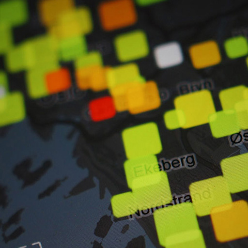
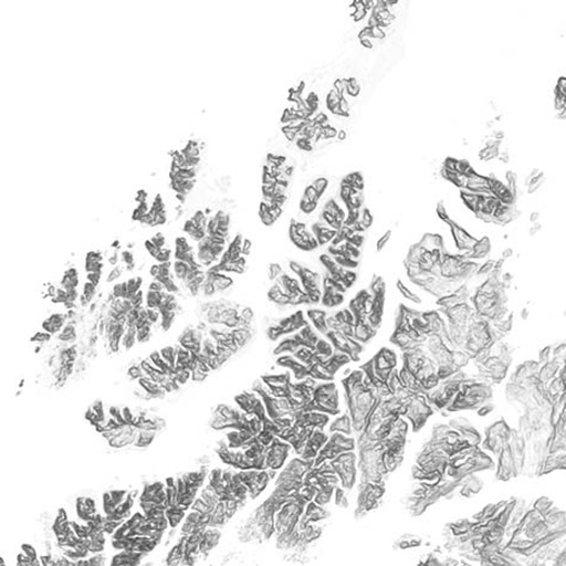
Terrafab
Own a small slice of Norway
-
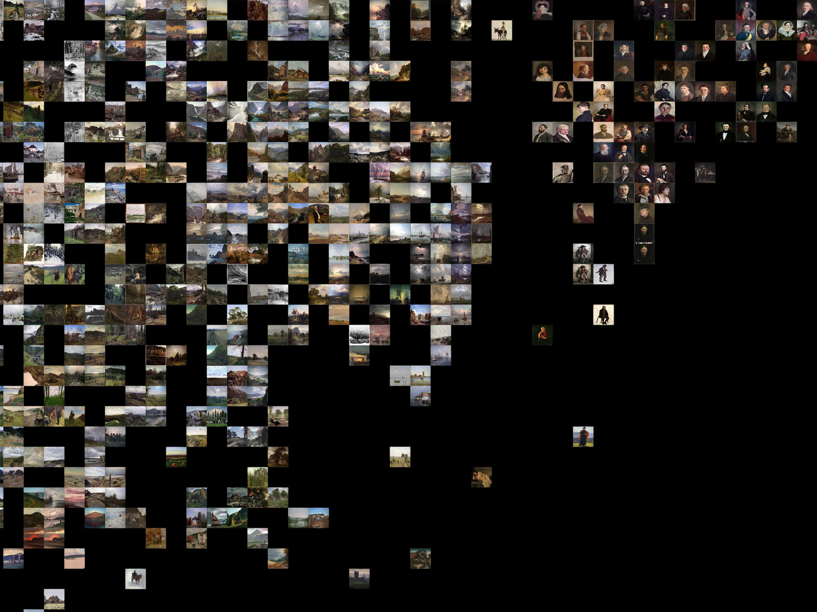
Repcol
Representativity in the collections of the Norwegian National Museum
-
Deluge
The migratory flight pattern of 300.000 Norwegians
-
Grantonaut
Slicing and dicing billions in Norwegian innovation funding
-
Seeplan
Research on making urban planning accessible through data visualization
-
Skoolgate
FOIA liberated Norwegian School Benchmarks - on a map
Other projects
-
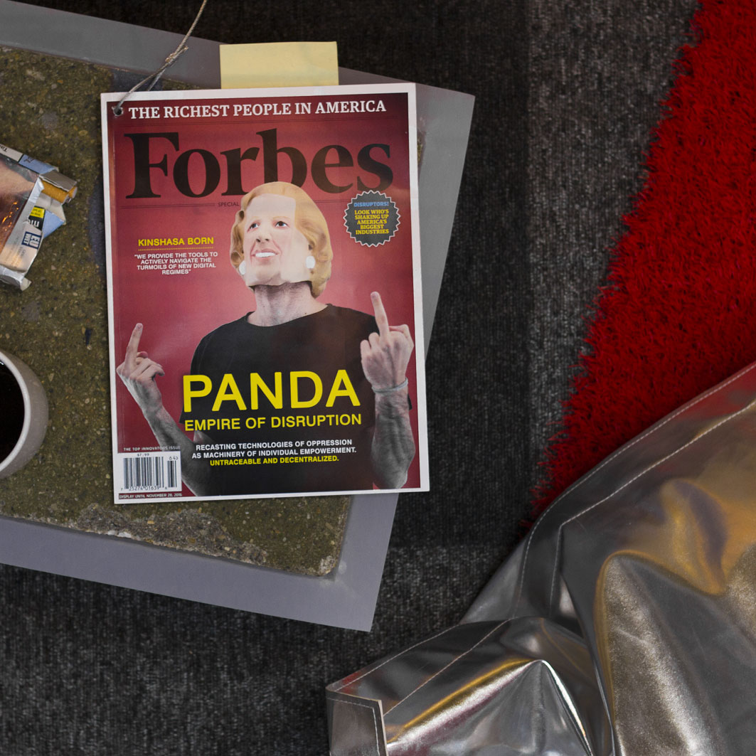
PANDA
Supercolluder for the gig economy
-
Principal Components
Machine learning in search of the uncanny
-
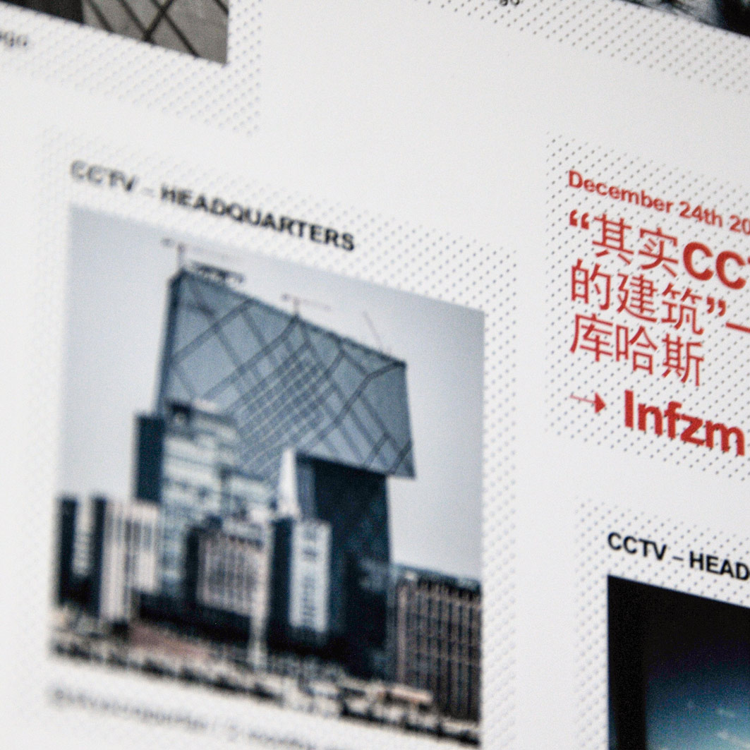
OMA Website
Simple surface, intricate clockwork
-

Underskog
Friendly community for the Norwegian cultural fringe.
-
Mapfest!
Helping liberate Norwegian geodata
-

Chorderoy
Efficient text input for mobile and wearable devices
-
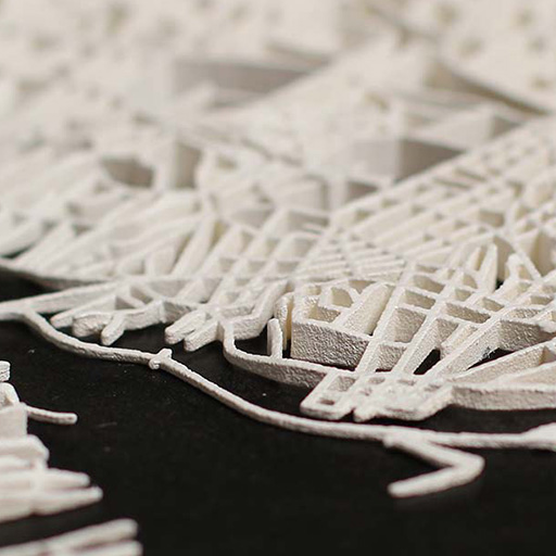
Intersections
Laser sintered topological maps for cars and social scientists
-

Bandwagon
Battle of the bands, local media edition