Project
Macroscope and portfolio
Duration
2014 - ongoing
Graphic Design
Detailed Credits
CMS
Sanity
Site
Representing The OMA on the web could never be about clear and singular messaging. Founded by Rem Koolhaas in the mid 1970s it has since grown into a diverse partnership. Its architectural catalogue runs to hundreds of buildings and masterplans, yet the organization is as much defined by their work in media, politics, renewable energy, technology, publishing and fashion.
The OMA Web Presence is realized as an incongruous macroscope interlacing sprawling, omnivorous modes of discovery with rational, drill-down archival interfaces. This duality seeks to provide utility to the hunters as well as the gatherers amongst its visitors, while reflecting the intentionally discordant organization it represents.
The project is a collaboration with the graphic designers of Node Berlin Oslo and the internal team at The OMA.
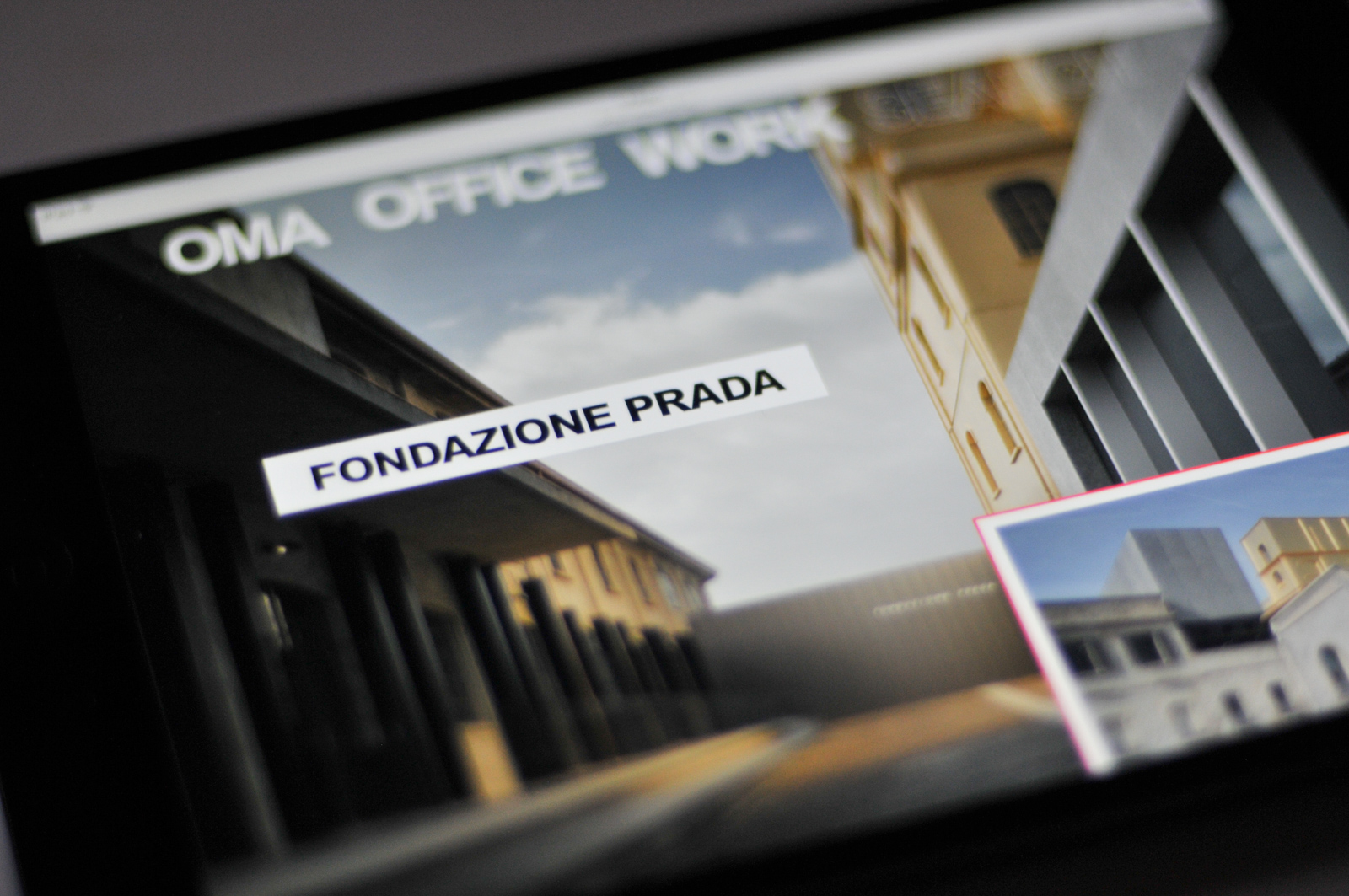
Graph
We approached the archival underpinnings as an separate project. The data was modelled using Sanity, our CMS and database curation tool. Then, thanks to the vehement perseverance of OMA's internal team, every milestone, geo-location, team credit, program detail and project description was revisited; topical relationships found; relevant images and publications retrieved from depositories and input at the highest possible quality.
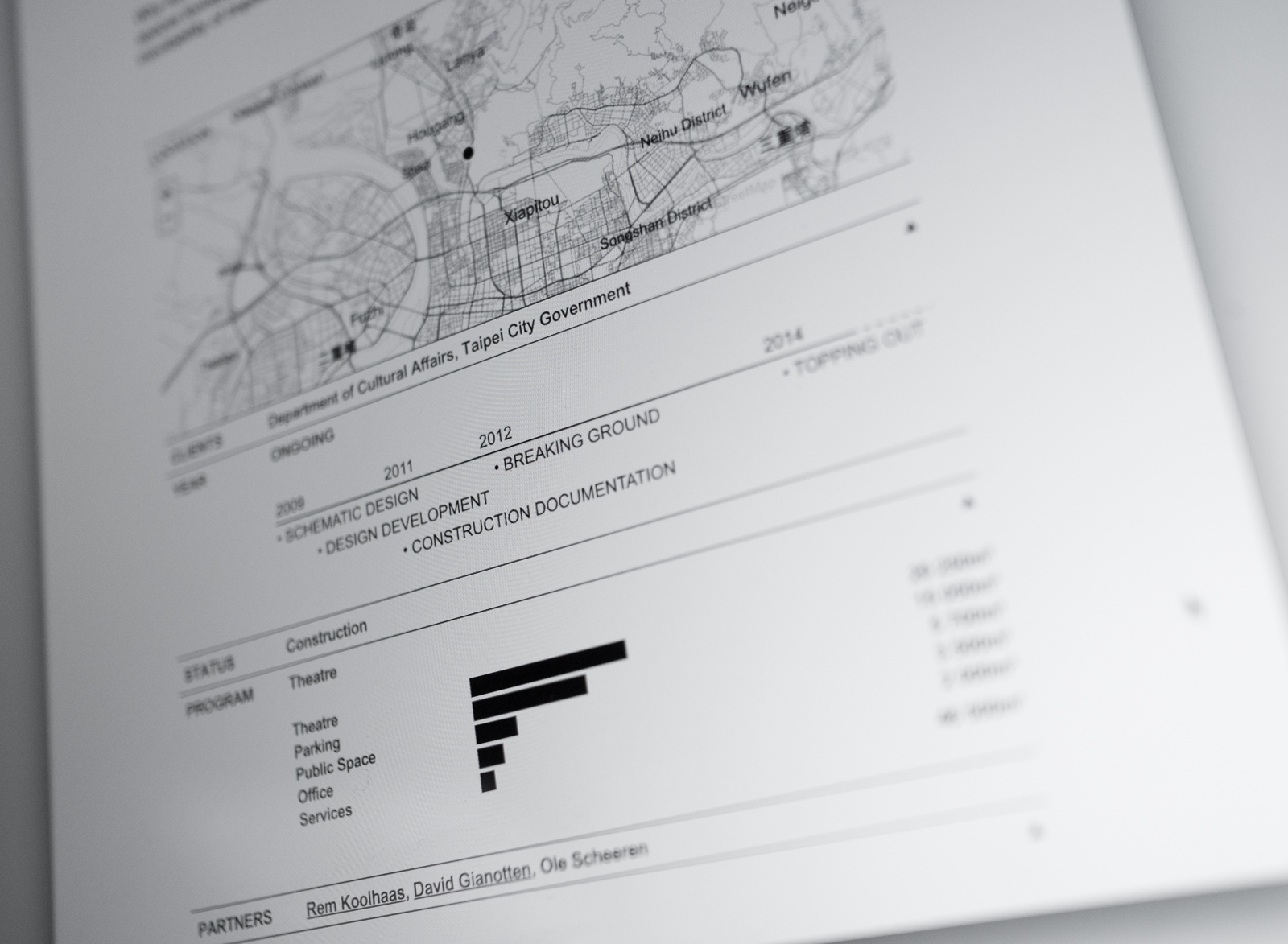
Having a comprehensive data-set was vital in realizing both of the core modalities of the site. Both the drill-down tools for filtering and traversal and the messy, associative dimensions are extracted from the same data.
Neutral
The concept dictated a significant density of information and our collaborators at Node Berlin Oslo developed a clear visual grammar that foregrounds the work presented. Neutral also informs the interaction design: flat documents, immediate transitions, no colors or even tones of gray. These strict principles are summarily subverted by select exploratory surprises.
Post Occupancy
Some of the most vivid portrayals of OMA structures are casual snapshots posted on social media. Based on the geo-location of projects, postings are gathered automatically as they appear and presented for curation. As they merge into the official project dossiers they undermine the project as crystalized intention, and provide glimpses of the structures in the everyday.
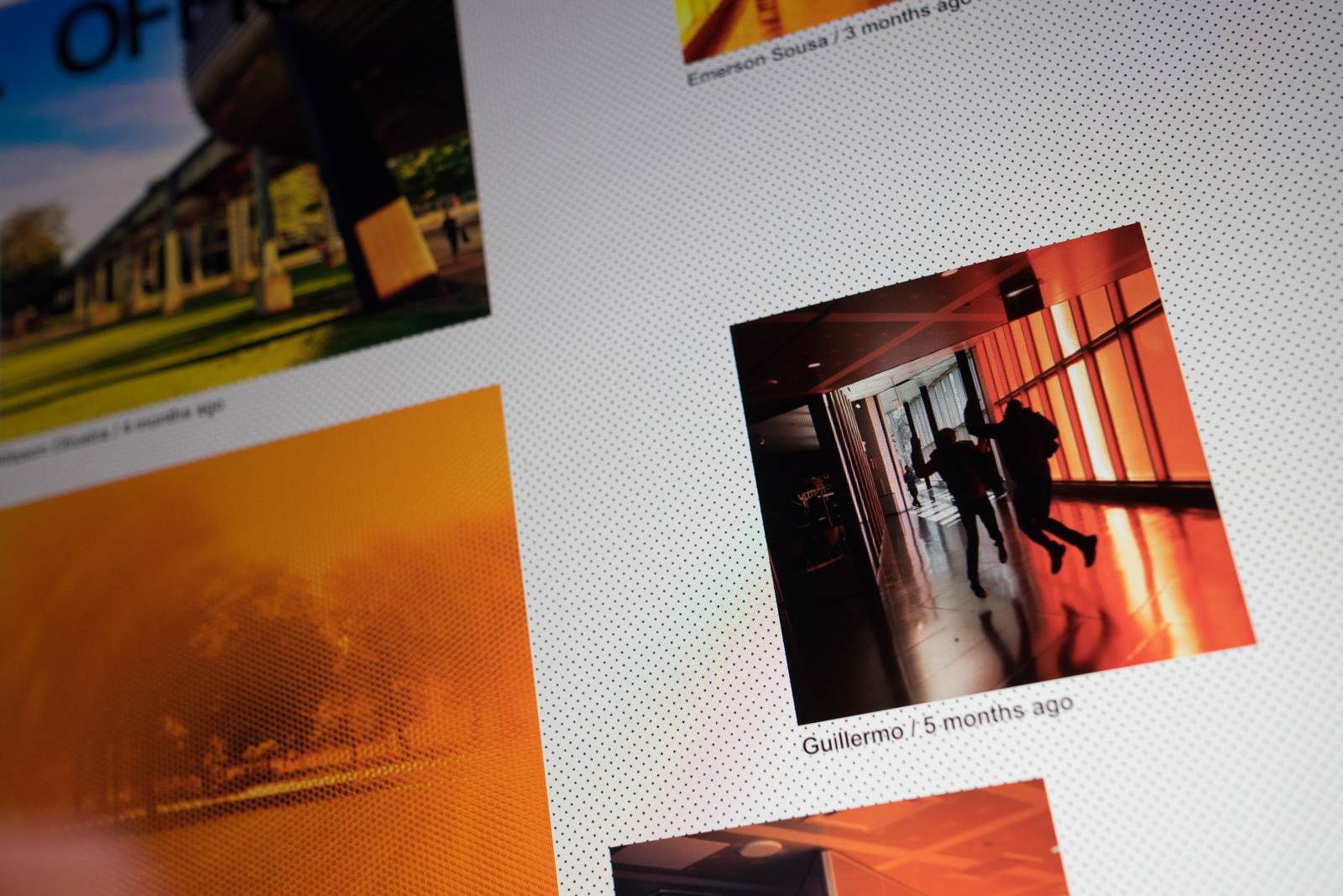
Macroscope
It all literally comes together on the front page: The moody, homeostatic algorithm illustrated in the animation below unwinds the entire OMA content graph every 30 minutes, balancing chronology, topicality and variety. Then, based on this traversal, every project, lecture, publication, news item, casual snapshot are assembled into a collage running (at the time of writing more than 100 meters of web) back to the Dutch Parliament Extension of 1978.
The OMA Web Presence is a neutral projector of the OMA’s vibrant, multiform work. Powering it, a comprehensive database and an intricate clockwork constantly modulating its presentation.
Other projects
-
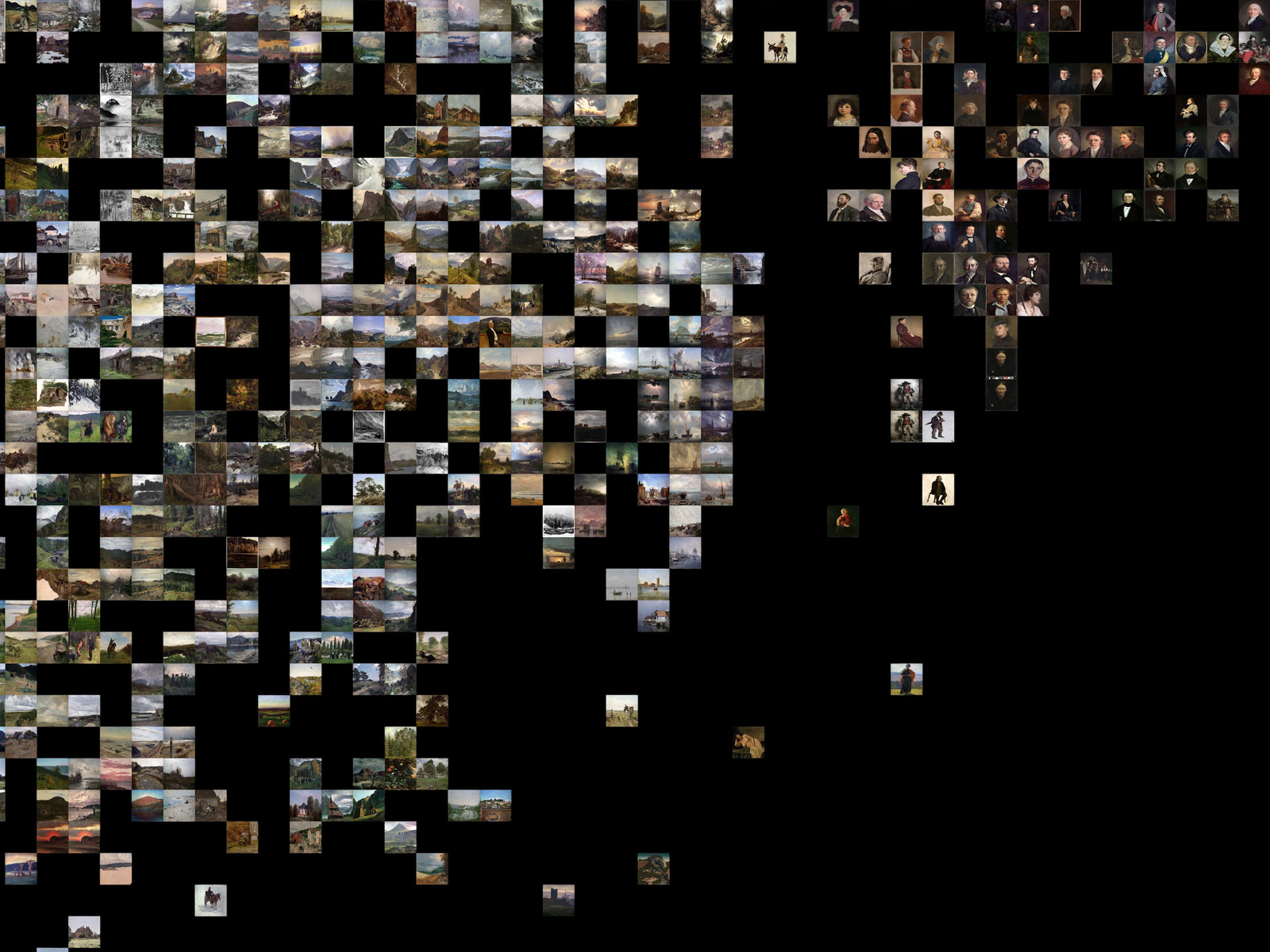
Principal Components
Machine learning in search of the uncanny
-
PANDA
Supercolluder for the gig economy
-
Terrafab
Own a small slice of Norway
-
Intersections
Laser sintered topological maps for cars and social scientists
-
Chorderoy
Efficient text input for mobile and wearable devices
-
Underskog
Friendly community for the Norwegian cultural fringe.
-
Mapfest!
Helping liberate Norwegian geodata
