
Project
Research on public sector data visualization
Tools
D3, three.js
License
Released
2012
Seeplan looks at how information design and data visualization may improve general access to city planning process. The Oslo Planning Authority has been scraped for the last 10 years of case history and a series of tools developed which place emphasis on different aspects of the information. As Oslo is currently being transformed by the rezoning and development of its coastline this is at times a natural focus for the project.
This work has been carried out as part of the Yourban project at the Oslo Schol of Architecture and Design.
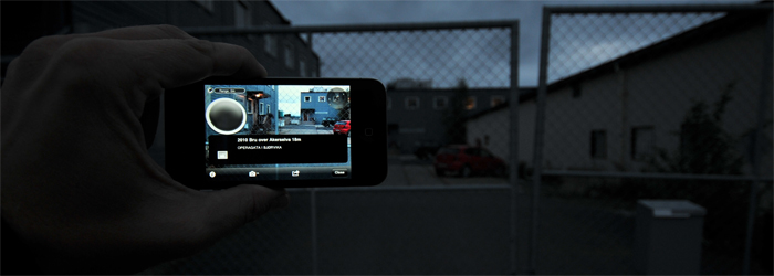
PlanAR
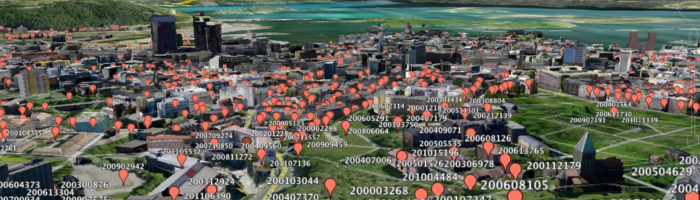
PlanAR is an augmented reality layer for the Layar smartphone app. The cases are simply drawn on top of the your view of the city. When clicking on a case you can link it on the planning authorities website Install the app and look it up on Layar.
Planimator Start app
How could one show the entire history of cases while preserving the spatial and the temporal? This presentation renders the individual cases three dimensionally as spheres on the plane of the city map and animates them in time. Spheres are sized according to the amount of correspondance the case has and colored by case type. The design highlights the continuous transformation of the city, areas of intense development and the sheer workload of the planning authority. It should be noted that the display of cases was inspired by the sterling service Chromaroma.
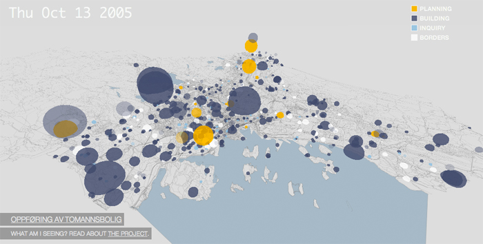
A series of high fives should be given to the three.js project for their excellent javascript WebGL scenegraph. The background map is generated from OpenStreetMap
Please note: Planimator unfortunately relies on web technologies such as WebGL, WebSockets and WebWorkers and will currently only run in Google's Chrome browser and on fairly recent hardware.
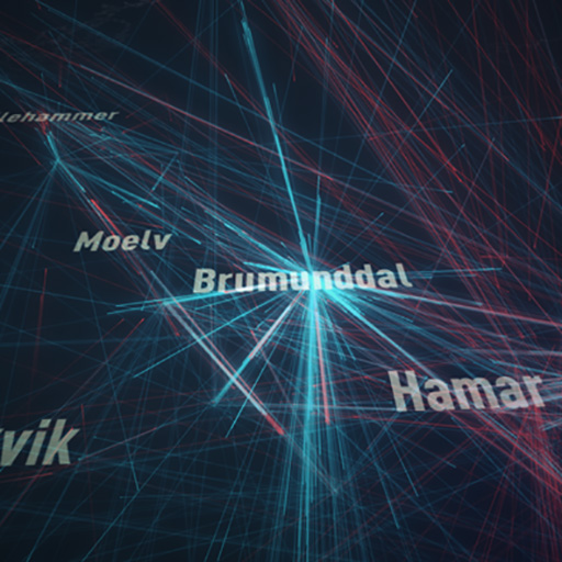
Networks
How are parties connected by projects? In this representation cases and their associated parties (applicants, case workers and all correspondents) are established as nodes in a network. The edges of the graph are the links between projects and parties.
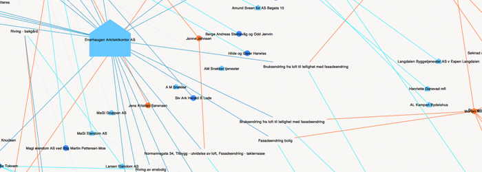
Queries are then run against the database to display groups of projects. Both time, polygonal geographic bounds and free text may be used to gather a group of cases to display the network for. For example one could show the network for the contractor Skanska or for entire areas of redevelopment.
Two samples are available as PDFs:
Major developments, timelines, cases, parties
When showing the previous visualization to a group of urbanists I asked them if they had any suggestions. One came from Halvor Ellefsen, a PhD fellow studying the Tjuvholmen process. He wanted to see the same relations, but with the temporal dimension added so that you could see which parties were involved at what point. This is interesting as time adds a narrative dimension to the linkages.
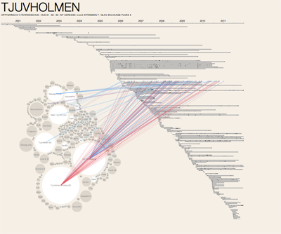
This presentation maps out all the cases on timelines. Rolling over a timeline shows the links between individual items of correspondance and the parties involved. Conversely, pointing to a party will display all the correspondance they have sent or received. Initially designed for fewer cases the result is somewhat too compact to be comfortably navigable at normal laptop resolutions. This should probably be adressed by allowing navigation along the timeline as well. Parties receiving less than 2 items of correspondance have been pruned from the presentation.
There are two development projects available:
Show Everything!
Instead of attempting to carefully prune and sift, what would happen if you tried to show everything? A simple scatterplots may reveal interesting patterns in data.
This is a plot of the roughly 1 million items of correspodance from 2001 to 2010. The y-axis should say be labeled 'case start date'. In the plot you can see holidays as white strips. A few cases show up with activity still after 10 years.
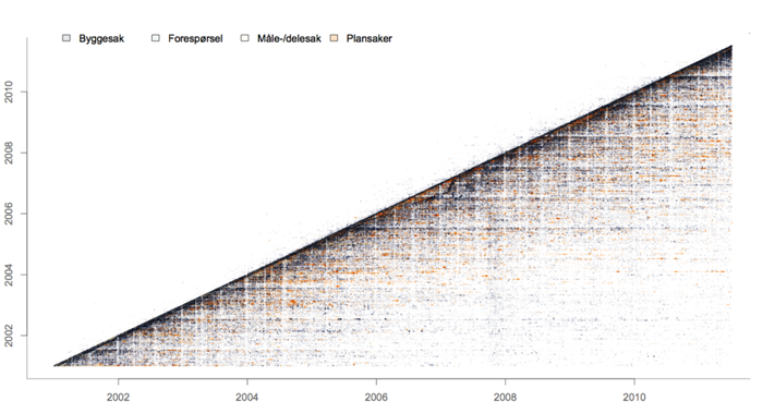 Click image to download it as a 54Mb PDF
It contains some artefacts which appear quite mysterious at first glance - for example this double wave visible in the plot of building case exchanges:
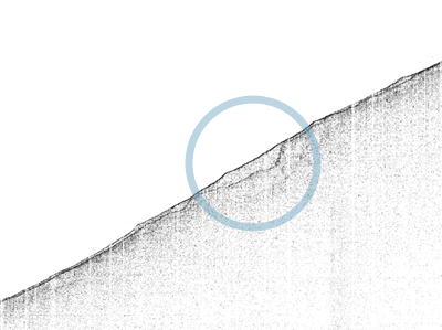
The first wave is the mail that you automatically get from the administration when submitting your request informing you to hang on for the actual reply. But what about the second wave? And why does it change with time? The second wave is the actual reply you get back. The reason the distance between the two slowly increases and decreases is that the case workers are picking from the same pile of backlog. The distance therefore simply grows when there is more work than they can handle.
The lines converge again around 2008, probably due to a decrease in case load. This may again have had something to do with the global financial meltdown.
Background
City planning is negotiated at the intersection of a diverse set political, individual and commercial sector interests. This process is largely hidden to us. Occasionally it may be discussed in the press, but as citizens we don't have direct access to underlying process.
Could we gain a greater understanding and ownership of our environments by better grasping how city planning happens? Who is involved? Who frequently collaborates with whom and on what projects? What decisions are made and when? Who is involved?
The above examples are not meant to fully answer these questions, but hopefully offers a few pointers as to what solutions that allow people to explore data on urban planning may come to look like.
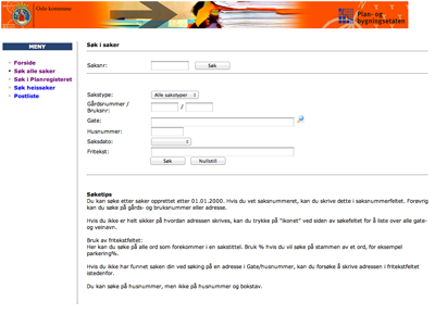
A screen grab of the search form the site the data was gathered from. This is the only point of entry into this data at the official site.
Why work with this data?
Transparency
Given the stringency of Norwegian building regulations and the public nature of the correspondance, construction and civic planning are one of the few capital intensive sectors of society where the public could have fairly good insight.
Density
For mobile applications focused on situational awareness it is vital to present data that is relevant by being in actual proximity to the user. Ideally the objects in question should be viewable in line of sight. The data set from the planning authority is well suited for this purpose as this is most often the case within the urban environs of Oslo.
Scraping Errata
If you're still reading you probably want to know the details on how the information was acquired.
The document identifiers of the exchanges on each case have a six digit serial number. Each year has its own series prefixed with the year. The scraper simply goes through each year starting from the first item. When encountering an unknown case it fetches it and gets all the associated exchanges. Fetching all the items took roughly a couple of weeks of machine time.
Ensuring quality
Assumptions about the source data was encoded as constraints in the database and as exceptions in the scraping software. With each broken assumption the process would simply stop so that the model could be changed to incorperate the encountered fact.
One aspect of the data was also found to have very low quality at the source, namely the names of the parties. It seems the planning authority has no registry for what parties it is corresponding with. One party may therefore be listed with several hundred slightly different spellings. An algorithm was therefore developed inspired by the documentation from Google's Refine, to cluster the 160.000 parties into 48.000 different clusters with canonical names
Geocoding
Most of the cases have their location qualified by a set of three numbers which make up their lot numbers. Unfortunately there is no generally available service to resolve these numbers to a geographical coordinate. Thomas Flemming, proprietor of bygninger.no, has found a public facing web site built by the Norwegian Mapping and Cadastre Authority which allows these lookups to be made. Apparently the site is only meant to be used by humans, but there is nothing stopping a machine from making the same lookups. It doesn't list a TOS either so there is no agreement to break. Thomas generously shared his code automating geocoding through this website.
Related projects


Other projects
-

PANDA
Supercolluder for the gig economy
-
Principal Components
Machine learning in search of the uncanny
-
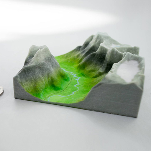
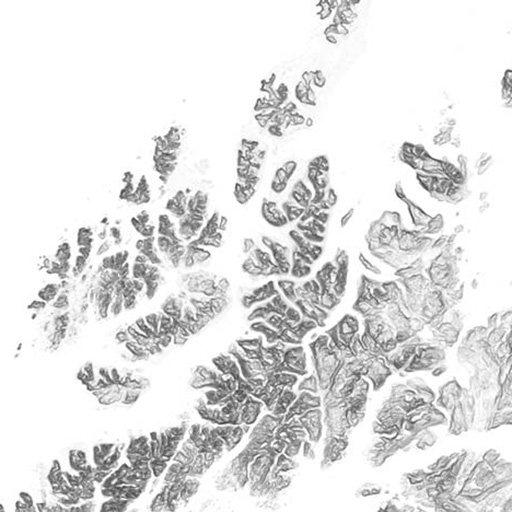
Terrafab
Own a small slice of Norway
-

OMA Website
Simple surface, intricate clockwork
-

Underskog
Friendly community for the Norwegian cultural fringe.
-
Mapfest!
Helping liberate Norwegian geodata
-

Chorderoy
Efficient text input for mobile and wearable devices
-
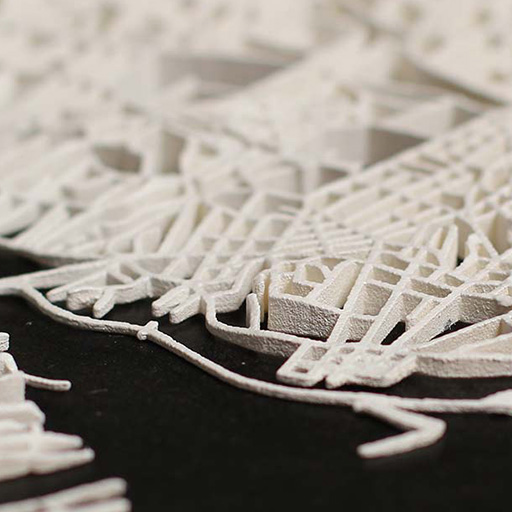
Intersections
Laser sintered topological maps for cars and social scientists